'I Feel Like My Lamp Experiment': Visualization Edition
Project Concept and Background
For last summer's final project of the semester, I was exploring the idea of creating a lamp or 'light painting' that can improve or sustain a user's mood based on their biometric readings (pulse rates), and which could later be developed for mental health use.
Upon embarking on the initial intention behind my project, I realized there was no conclusive research that had firm data on the correlation between emotions and pulse rates (although the correlation is present). So I decided to turn my project around into one of an experimental nature. It involved asking people how they felt before the experiment, then showing them two extreme ends of a color spectrum that were mapped based on their pulse rate measurements, and then asking them again how they felt after they were shown both colors. The chosen color spectrum (red, orange, yellow, green and blue) was arbitrarily based on the colors of the heart rate zones (usually seen in workouts) and its correspondence to the heart rate ranges.
With all the data that I had collected from this experiment, I was unsure what to do with it or whether I wanted to continue the project in general. However, when this mid-term project was announced, my first instinct was to visualize the dataset that had resulted from it for people to view, or to perhaps make better sense of it.
What inspired this project:
From the norm of paintings evoking emotions, to emotions evoking paintings. I decided to explore how paintings would look like if our emotions were the ones to evoke it instead, and in turn if these paintings could improve our moods/emotions. The lamp was therefore designed to resemble the outer frame of a painting.
My initial intentions with the Mid-Term Project
- Creating my own .json file from the data, and analyzing it for use in the visualization
- Using p5.js to visualize the data
- User interaction so far includes: 1) hovering through visualizations, and 2) asking people how they are feeling by selecting from a set of pre-determined emotions and in turn show them the color they would get on the lamp to improve/sustain their mood based on the dataset (might be a reach).
- A build off idea from point (2) is that I could ask them how they felt after seeing that color on screen and store their answers (also not sure about my capabilities to achieve this)… Ruta however advised me to leave this for when learn more about databases in the coming weeks.
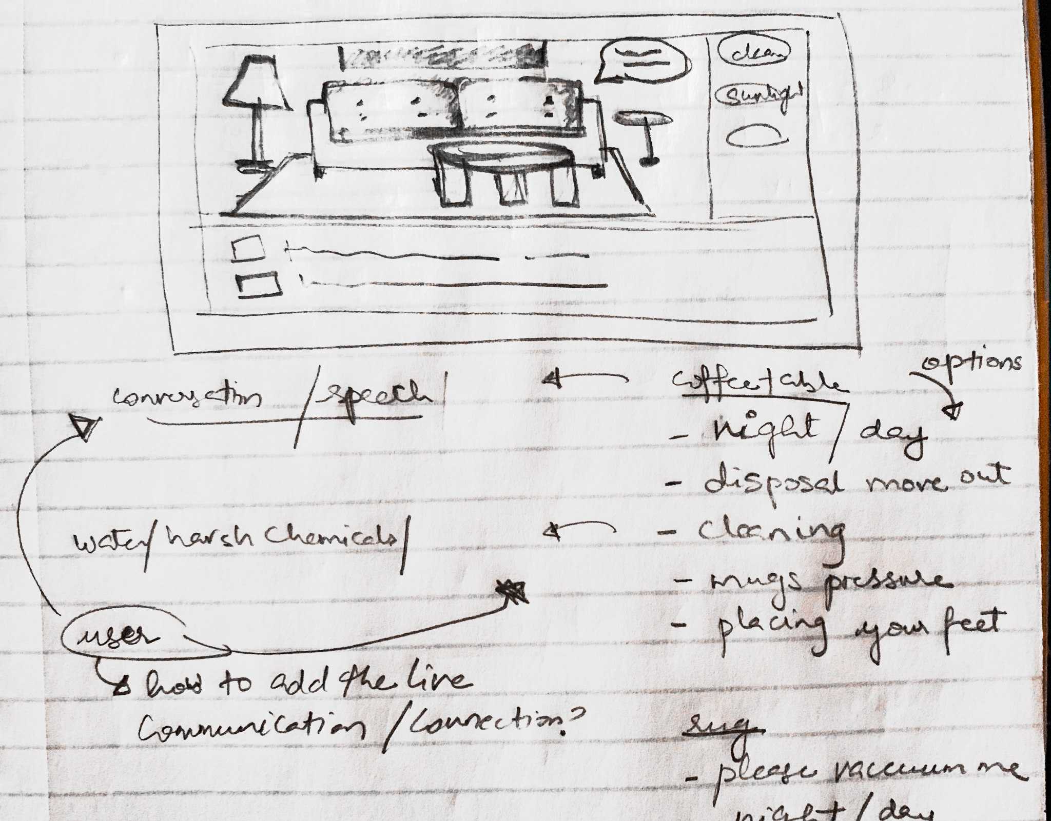
Wireframe Prototype

Rough wireframe sketch
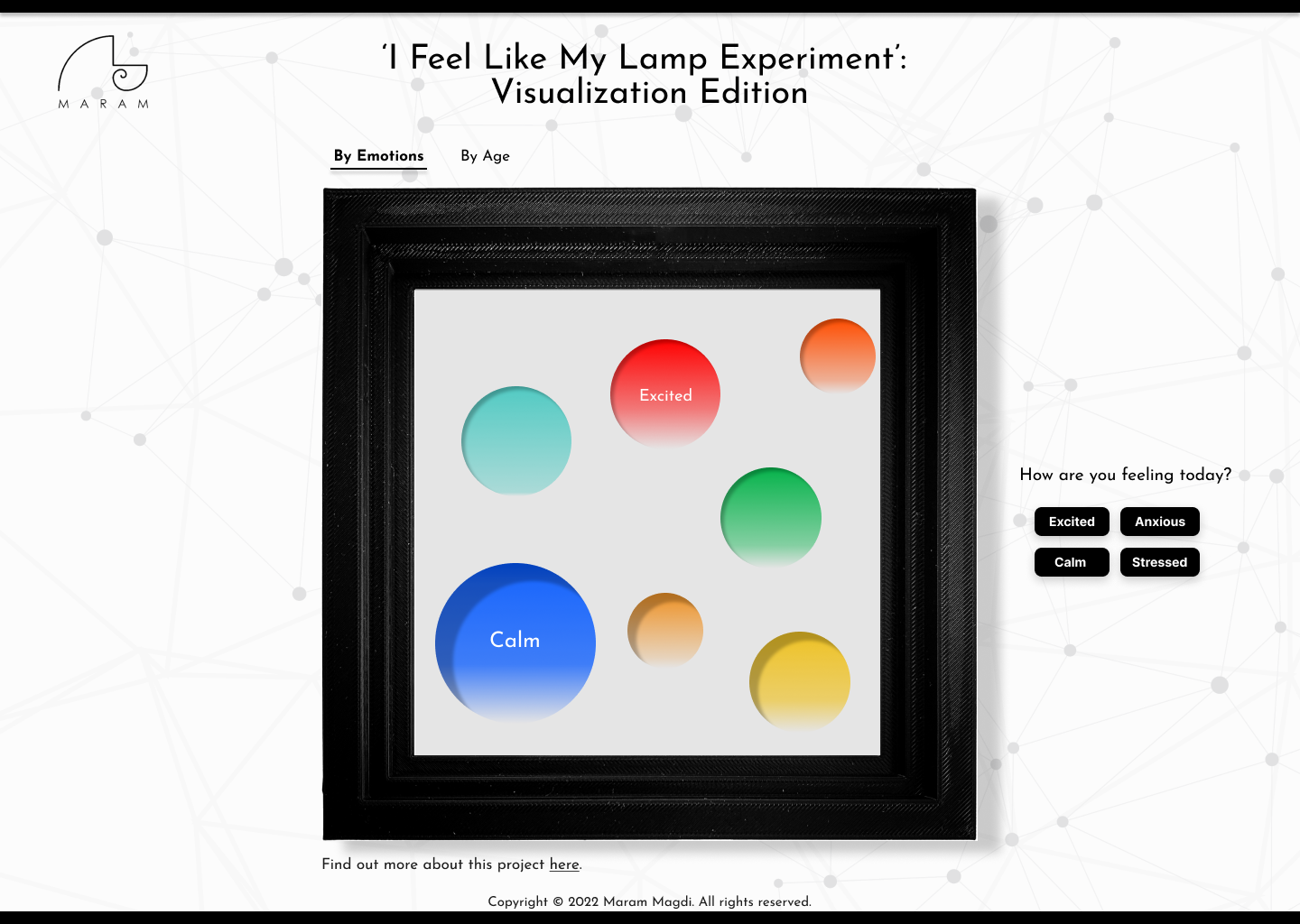
High fidelity wireframe - page 1
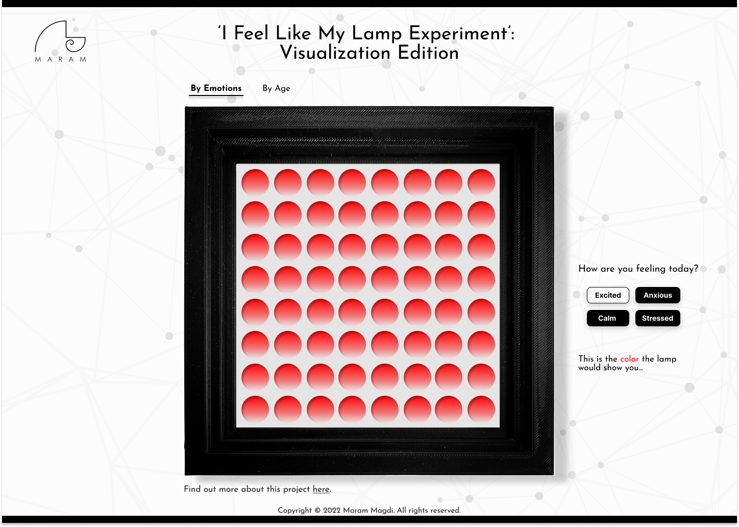
High fidelity wireframe - page 2
My initial idea was to have 2 tabs of pages, one for visualization 'by emotions' (showing 3 data variables: color, emotion, number of people) and the other for visualization 'by age' (showing 4 data variables: color, emotion, number of people, and age). I would also have an option on the side of the page for people to select how they felt through buttons and show a resulting color of what the lamp would show them based on the dataset I had.
I then decided to leave out the 'by age' visualization, mostly due to the complexity of showing a visualization of 4 data variables and it being my first time to visualize data in general using p5.js. I ended up utilizing the 2nd page tab (called 'Your Lamp') to display the resulting color the lamp would show you based on a combination of emotions you chose, rather than a single emotion (it was Anastasia's suggestion that people do not generally feel one emotion at a time). These emotions could be chosen using sliders instead of buttons. The 'by emotions' visualization was later renamed to 'statistics'.

2nd page tab showing selection of emotions through sliders
Design direction
I opted for a clean minimalistic and monochromatic design because I wanted the colors of the visualizations to be the main focus. Additionally, my intention with the monochrome aesthetics was to not have it affect people's perception of colors.
Also, my physical fabrication of the lamp included light strips whose small circular hued impressions would not diffuse no matter how many layers of diffusing material I added. This resulted with a lamp design that showed 'organized' circular spots of light, and I decided to adopt it as an 'undeniable' design for the lamp, and therefore also inspired the shapes of circles in the visualization. The frequency of the lights 'on and off' in the physical fabricated lamp is also recreated in the visualization by randomizing the alpha value for the fill of the circles.
Data Visualization
The visualization for the project ended up in terms of two versions;
1) Statistics: A statistical visualization directly representing the dataset collected. It shows the emotions people experienced after viewing the light colors from the lamp, which were limited to red, orange, yellow, green and blue. Based on people's feedback, the lamp's light colors evoked different emotions. The colors shown represent a weighted averaged color of the lamp's light colors based on recurrence of a particular emotion, while the size of the circles represent the number of people. The cooler a color is, the more people felt biased towards the cooler end of the light spectrum, and vice versa.
2) Your Lamp: An interactive visualization engaging the user to find out which light color their very own lamp would show them to improve their mood based on how they feel. Resulting color is a combined color determined by their emotion ratio. These colors are based on people's data and feedback. If the user inputs a single emotion, the slider will not have an effect on the resulting color since their emotion ratio signifies one emotion, therefore one unchanging color.
Major challenges and solutions
With the original unprocessed dataset I had, it was quiet difficult to sift through the data and get the information I needed solely by writing up the code with JavaScript to process it. I found it much easier to do this on the excel spreadsheet instead, and decided to only store the results I needed in a separate .json file for each version of visualization.
The original raw dataset collected looked like this initially:

Emotion 1 represented what people originally felt before seeing any light colors. Emotions 2 and 3 were what people felt after they saw lights of Color 1 and 2 respectively. I decided to combine Emotion 2 and Emotion 3 to Emotion 1 and Emotion 2 respectively, and Color 2 to Color 1. This is because I wanted a more direct dataset that showed emotions felt before seeing a certain light color, and after. Emotion 1 was then redefined to represent the emotions felt before seeing a particular light color (Color 1), and Emotion 2 to be the emotions felt after seeing Color 1.
The modified dataset would look like this:

I also tried to combine similar emotions under an umbrella category to try to unify and limit the wide spectrum of different emotions. For example, some of the emotions noted were changed per the following key:
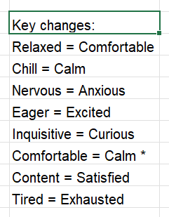
The left side emotion keyword was replaced with the right side keyword
Additionally, I calculated the weighted average RGB value for each emotion based on the different colors correlating to it and the recurrence (frequency). I later extracted the calculated RGB value for each emotion, along with the number of people who experienced this emotion for each visualization (therefore using two .json files). For the 'statistics' visualization, I calculated the RGB values for Emotion 2, while for the 'Your Lamp' visualization, I calculated them for Emotion 1.
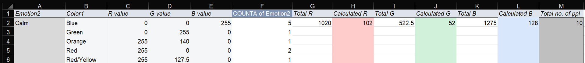
Example of the weigthed average rgb calculation for the calm emotion ('statistics' visualization)

Showing part of the extracted calculated data for the .json file of 'Statistics' visualization
I admit that if I were to collect live data for this, my solution will have to change. I might have to either codify this entirely with JavaScript, or have the live data be added real-time on to a spreadsheet with the extracted data be automatically calculated and updated in the spreadsheet (if possible), for it to be fed back again to the visualization.
Code
I found some difficulty in trying to figure out how to process the data into the visualization for 'Your Lamp', since it required real-time calculation from the slider input. Initially, I tried to do that in the function draw(), but had a hard time making it do the calculation only when there was an input. With assistance from Dora, she told me there was a 'change' event listener that I could add outside of function draw(), and she guided me through how I could saves the slider values into an object to keep track of them (line 83). The resulting code looked like this:
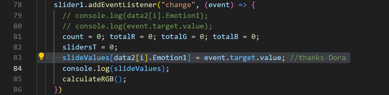
I also had a counter to check how many sliders were 'on' by checking if the values were above 100. I then used this counter to set the background color back to grey (RGB = 220) if there was no input of emotions (see below image for code).
Calculating the combined color for the 'Your Lamp' visualization:
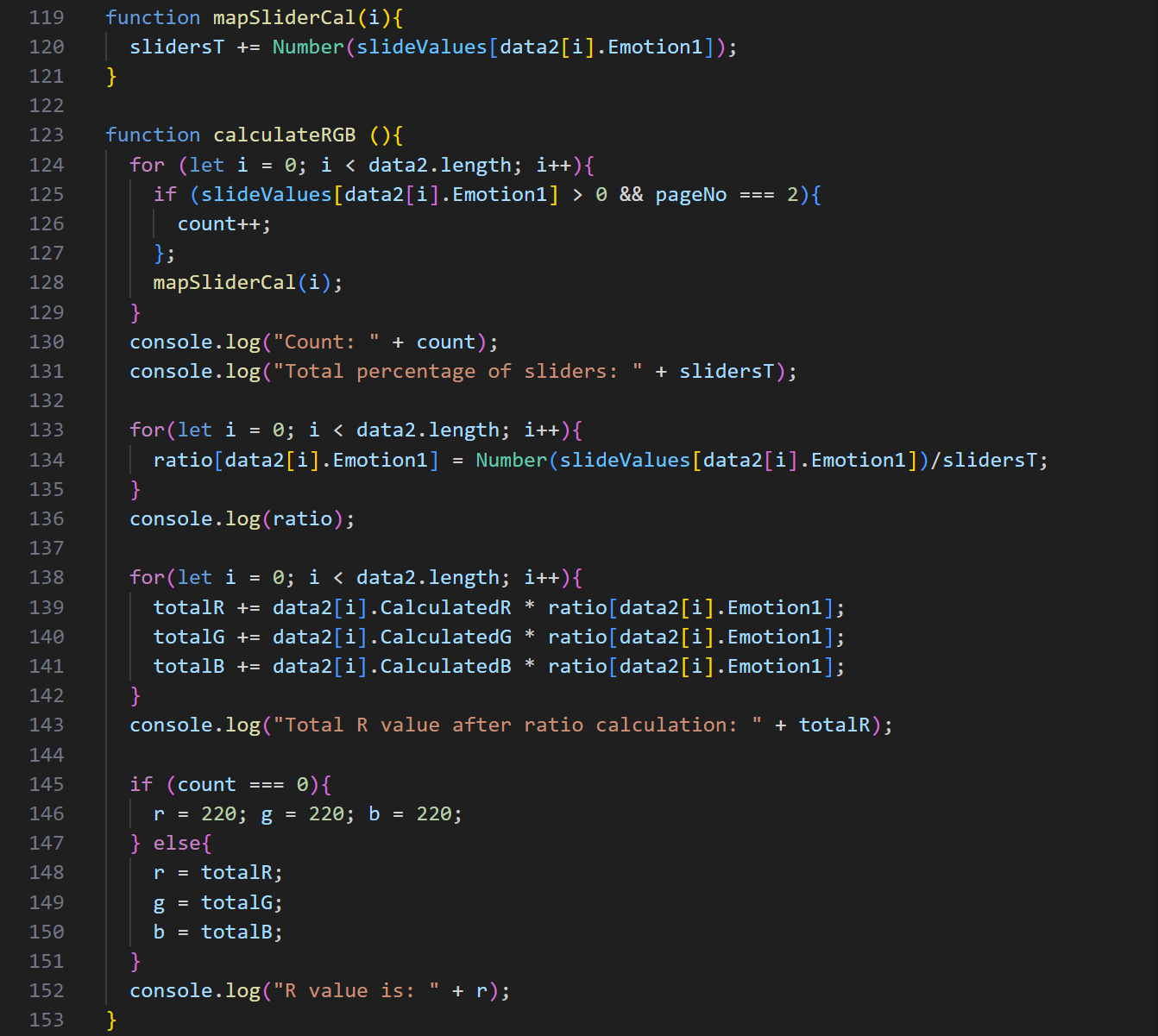
1) I added the total of all the slider values in a variable called slidersT.
2) I created an object variable called 'ratio' to store the ratio for each emotion out of 1 (whether the emotion sliders were on or not).
3) The ratio was calculated by taking the slider value of each emotion and dividing that by slidersT (sliders value total). If an emotion was not selected, their slider value would be 0, and therefore its emotion ratio would be 0.
4) Each emotion's RGB value would then be calculated by multiplying the RGB values from the .json file corresponding to that emotion with the ratio calculated for it. If the ratio was 0, then the RGB value would also be 0.
5) The resulting combined RGB value for the visualization would then be extracted by adding all the RGB values of all emotions altogether, and used for the fill() in function draw(). This way the RGB value is never lower than the lowest corresponding RGB value from the dataset represented in the .json file, and never higher than the highest corresponding RGB value.
coded function to calculate combined color for the 'your lamp' visualization
Lessons learned and potential next steps
- After completing the code, I realized I should have filtered out the data records that evoked negative emotions (negative Emotion 2) after seeing the resulting color (Color 1) for the 'Your Lamp' dataset. I plan on doing that for the future.
- I would like to take input from the user of how they felt after seeing the resulting color in the 'Your Lamp' visualization tab page and store it, and perhaps have a live update of the 'Statistics' visualization based on these stored answers.
- I would like to enhance the visualization style (Dora mentioned to maybe have more blurred out edges for the circles to show the effect of light).